
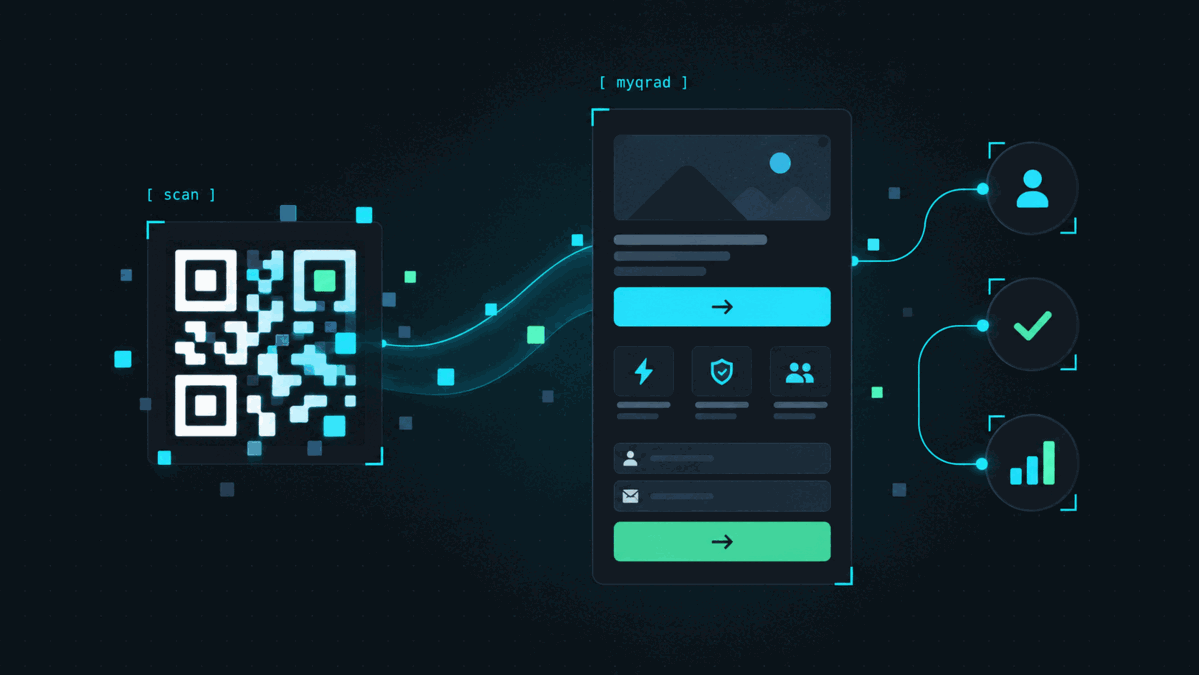
A QR code can do its job perfectly and still produce a disappointing campaign.
The phone scans it. The page opens. Then the visitor has no idea what to do next.
The QR itself is only the entrance. The landing page decides whether the scan becomes useful.
Start with the promise beside the QR code
The best landing pages begin before somebody scans.
If the printed material says “Scan for 20% off,” the page should immediately show the offer.
If it says “Scan for the menu,” the visitor should see the menu.
If it says “Scan to contact us,” contact options should be obvious.
Do not make people search for the thing they were promised.
Remember where the visitor came from
A person scanning a QR is usually on a phone and often standing somewhere.
They may be in a shop, sitting at a restaurant table, walking past a poster or holding a product package.
That is very different from somebody browsing a website at a desk.
The page should respect that context.
Keep the first screen simple
The top of the landing page should answer three questions quickly:
- Where am I?
- What is this?
- What should I do?
A short headline, one clear explanation and one obvious action are often enough.
You can provide more information further down the page if it is useful.
One strong action is better than six weak ones
A landing page becomes confusing when every element competes for attention.
If the purpose of the campaign is to redeem an offer, make redemption the main action.
If the goal is to join an email list, make the signup obvious.
If the visitor needs directions, do not bury the location link underneath unrelated social buttons.
There can be secondary options, but the primary action should be easy to recognize.
Design for a thumb, not a mouse
Buttons should be large enough to tap comfortably.
Links should not be packed tightly together. Text should be readable without zooming. Important controls should not sit against the edge of the screen.
The QR was scanned on a mobile device, so the page should feel like it was designed for one.
Do not recreate your entire website
A QR landing page does not have to be a miniature version of your company website.
In many cases it should be much simpler.
A restaurant promotion might need:
- the offer
- the redemption code
- the expiration date
- one button
A contact page might need:
- a name
- a short description
- a phone link
- an email link
- a website
The visitor can always continue to the full website if necessary.
Use images carefully
Images can make a campaign feel polished, but they can also dominate a small screen.
A large photograph that pushes the actual offer below the fold may work against the campaign.
Use an image when it adds context. Keep it proportional and leave enough room for the information that matters.
Make the page easy to update
This is where dynamic QR campaigns become particularly useful.
If the landing page is part of the campaign, you can update the content without changing the printed QR.
A weekend promotion can become a holiday promotion. Event details can be corrected. A button can point somewhere new. Contact information can be updated.
The physical code can remain in circulation while the page evolves.
Check the page by actually scanning it
Preview tools are useful, but there is no substitute for using the campaign the way a visitor will.
Print the QR or display it on another screen. Scan it with a normal phone. Read the page at arm’s length. Tap the buttons.
If something feels awkward, it probably feels awkward to your visitors too.
A good QR landing page feels obvious
The visitor should not have to think about the interface.
They scanned because something on the physical material interested them.
The page has one job: continue that interaction without getting in the way.